
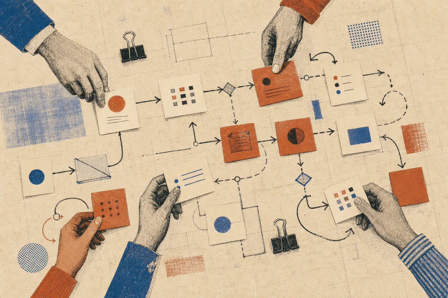
Ask a team to show you how an ordinary piece of work gets done and someone will usually open a slide deck. Boxes line up. Arrows point forward. Each step has a clear owner. The picture feels calm, sensible, and almost always false. Real work bends around missing data, late replies, old software, customer exceptions, and decisions that live in one person’s head. None of that makes the team bad at its job. It means the neat diagram records the process the company meant to build, not the process people use.
That gap matters. A firm cannot improve work it cannot see. When leaders treat the approved map as fact, they fix the wrong step, add checks where trust would work, or buy software to speed up a task that was never the true delay. A better starting point is plain: map what happens on a difficult Tuesday, with the actual people, tools, queues, and choices in view.
Begin with an object, not a department
Most process projects start with an org chart. Sales owns one lane, operations another, and finance a third. Yet customers do not buy departments. They ask for an outcome: a quote, a repaired item, a refund, a shipment. Follow one such object from the first request to the final result. It may be an order, an invoice, a candidate, or a support case. The object gives the map a clear start and end. It also reveals each handoff without turning the work into a debate about turf.
Choose one recent example and reconstruct its path. Ask the people who touched it what arrived, what they checked, what they changed, what they waited for, and what they sent next. Open the tools they used. Look at the email thread. Note the spreadsheet tab, the printed checklist, and the message sent through chat. Evidence keeps the session tied to work rather than memory or policy.
The workaround is not noise around the process. It is part of the process.
Record waits as carefully as work
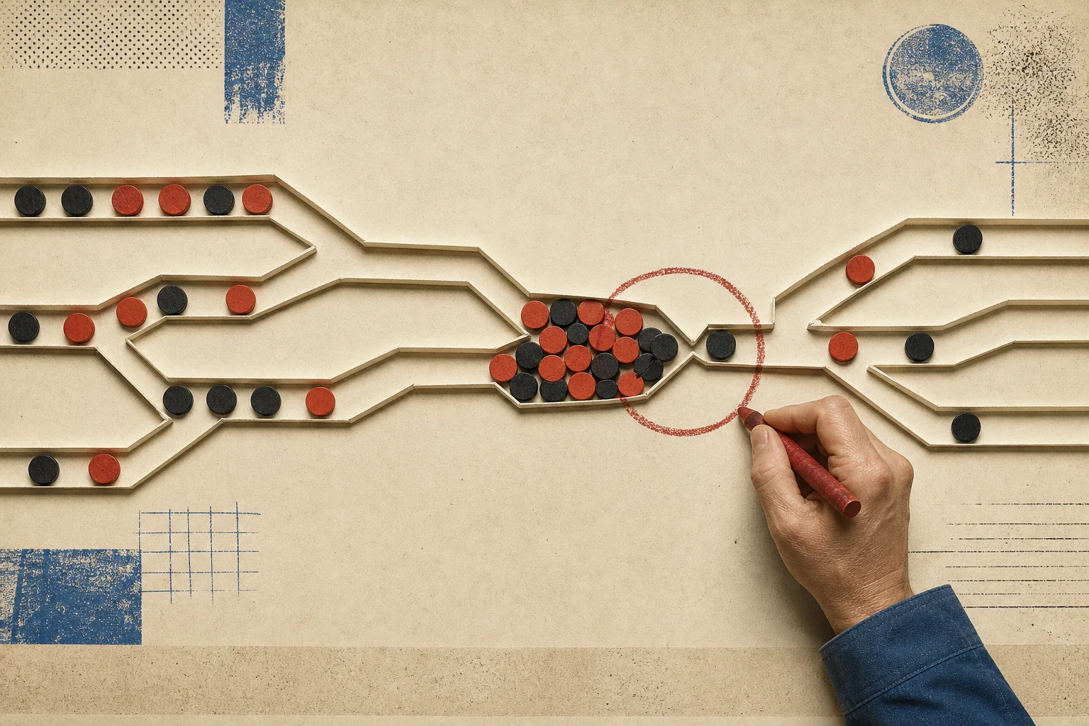
Teams often measure touch time: the ten minutes needed to review a form or the twenty minutes needed to prepare a quote. Customers feel elapsed time. A task may take fifteen minutes of effort and sit for three days in a shared inbox. Put both numbers on the map. Mark every queue, batch, approval, and return loop. A long horizontal line for a wait can tell more truth than a tidy box marked “review.”
Then ask why the queue exists. Sometimes demand arrives faster than the team can handle it. More often, people batch work to cut the cost of switching tasks, wait for a manager who holds scarce authority, or delay a case because its next step is unclear. Each cause calls for a different fix. More staff may help with excess demand. Clear limits may remove an approval. Better entry rules may stop poor work from entering the queue.
Find the rule beneath the workaround
A workaround often carries useful knowledge. A service agent keeps a private list because the main system cannot show priority. An analyst copies data into a spreadsheet because the report hides the detail needed to make a choice. A warehouse worker calls a colleague before releasing an unusual order. These acts may look wasteful from far away. Up close, each one answers a need the formal process missed.
Do not erase the workaround on sight. Ask what risk it controls or what signal it supplies. Then decide whether to bring that rule into the shared process. The private list may become a visible queue. The spreadsheet logic may become a report filter. The phone call may become a clear exception path. Improvement should keep the judgment and remove the needless strain.
Change one constraint at a time
Once a team sees the whole path, the urge to redesign everything can take over. Resist it. Broad change makes cause and effect hard to read. Pick the point that most limits the outcome and run a small test. Remove one approval for low-risk cases. Set a daily time to clear a queue. Ask for one missing field at intake. Give the test a measure, an owner, and an end date.
Measure an outcome that the customer or the team can feel. Useful measures include total lead time, the share of work returned for more detail, the age of the oldest case, and the number of cases finished right the first time. Activity counts can help, but they do not prove that the process works. Sending more email may raise activity while making the result worse.
After the test, update the map. Cross out the old line. Add the new route. Date the change and write down what the team learned. This is where the idea of a palimpsest earns its place: a good process record keeps traces of earlier choices. Those traces stop the firm from repeating old errors and help new staff understand why a rule exists.
Keep the map close to the work
A process map should not end its life in a project folder. Put it where the team reviews work. Use it when a case goes wrong, when demand changes, or when a new tool arrives. Let the people who run the process mark it up. The map will stay rough. That is a strength. A living record invites questions; a polished final diagram asks to be admired and ignored.
The goal is not a process with no variation. Good work often needs judgment. The goal is to make the normal path clear, the exceptions safe, and the delays visible. Start with one real object. Follow it without blame. Draw the waits. Study the workarounds. Then change the narrowest point and watch what happens. The result will not look as neat as the slide deck. It will be far more useful.